Colors
The following guidelines ensure a recognizable brand image, orientation and visual hierarchy.
Principles
 Supportive
 Personal
 Joyful
Use
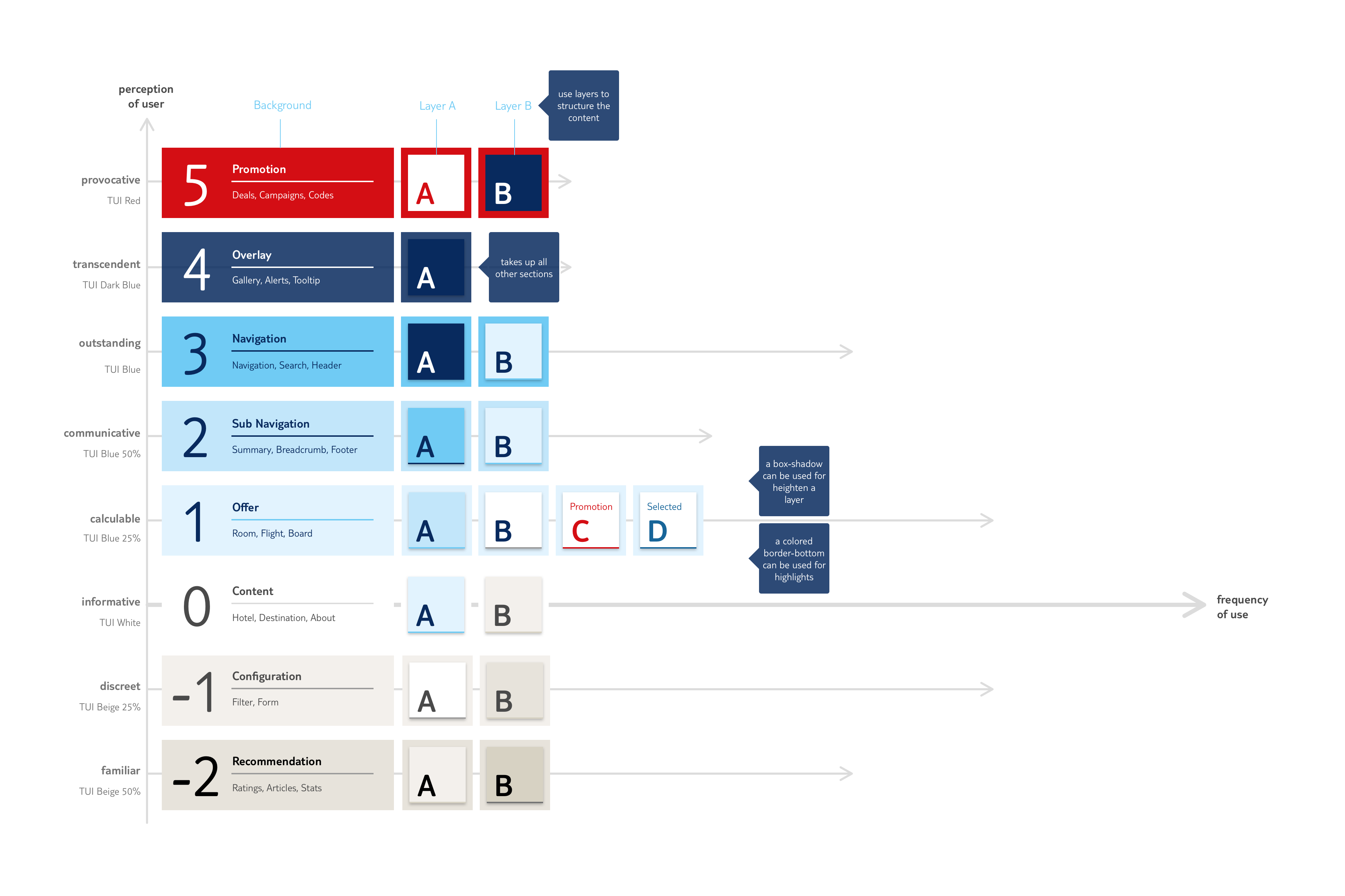
The generous areas in TUI White indicate the content of the area. The accent color TUI RED is only used for current promotions and then in moderation. TUI Blue and its gradations for a cool, calculated picture was marked in first line deals. TUI BEIGE 25 puts the configuration of the offers in the background.
Color Balance
Semantic Colors
- Primary Promotion
- #D40E14 212, 14, 20
- Default Overlay
- #092A5E 9, 42, 94
- Secondary Navigation
- #70CBF4 112, 203, 244
- Secondary-Bright Sub Navigation
- #C2E6FA 194, 230, 250
- Secondary-Light Offer
- #E2F3FE 226, 243, 254
- Background Content
- #FFFFF 255, 255, 255
- Shade-Light Configuration
- #F3F0EC 243, 240, 236
- Shade-Light Recommendation
- #E7E3DB 231, 227, 219
Perceptual Elevator